Had a chat with Rachel yesterday about my quote and we have decided that the quote is too long. We also decided that the new shorter quote 'Art is the triumph over chaos' is a stronger working angle to play with. The materials i hope to work with are more suited to this quote.
Oh! I also started to play around with origami and I have created a 'Spike Ball' and I like it.
Happy. Happy. Happy.

Wednesday, 24 October 2012
Tuesday, 23 October 2012
JOHN WILSON
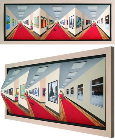
When I was out shopping in the Trafford Centre on saturday to buy my Macbook, I came across this art shop that had such an unusual piece of work at the front of it as its display. As you walk past, the, what seemed to be 2d painting turned into a 3d painting. It was something that I have never seen before. The painting literally shot out to me. It was another meaning to painting or even optical illusion.
The unusual but very intriguing painting 'mind games' was created by John Wilson.


The unusual but very intriguing painting 'mind games' was created by John Wilson.

LAST WEEKS THOUGHTS
16/10/12
As you can see from my previous post from here, I created a Julian Opie InDesign illustration and placed it onto a double page spread design. I was creative in the way I enlarged the starting letter and placed the remaining text inside the letter itself.
It was a great task to start my InDesign learning with.
17/10/12
Today was chaos as I was cramming in work during my dinner break to make sure I keep up to date with everything. I feel much better but I still need to get organised and think of a way to plan my time effectively. I think thats tomorrows job!
18/10/12
Had a talk with dave today and I've spoke to claire and I now know what I need to do to complete my corporate for the time being.
I need to buy some card to experiment with and maybe look into buying a decorative hole puncher.
I also created a timetable today to use my time in college effectively.
I've got the review dates for all year and next on the side of my wall so that I don't miss any or any other deadlines.
Julian Opie double page spread design
Experimentation:

Final outcome:

Above is my design experimentation for my double page spread task given by Jim. The idea was to be creative with the text layout and format which had to be complimented by my Julian Opie inspired InDesign piece. I'm very happy with how the final outcome came along.
Wednesday, 10 October 2012
NEWS UPDATE!
I can't believe it, I checked my emails about my Graphic Design Twitter account, like I usually would and I was astonished by what I read.
A peice of art at the Tate Modern Art Gallery in London has been defaced!
Apparently a male was seen admiring art work and then after a moment of looking, he calmly got up and approached the peice of work and defaced it.

Here is the link from my Email
http://hyperallergic.com/58144/rothko-defaced-at-tate-modern/
Below is also the twitter status linked up with my twitter account
https://twitter.com/WrightTG/status/254951911126605825
A peice of art at the Tate Modern Art Gallery in London has been defaced!
Apparently a male was seen admiring art work and then after a moment of looking, he calmly got up and approached the peice of work and defaced it.

Here is the link from my Email
http://hyperallergic.com/58144/rothko-defaced-at-tate-modern/
Below is also the twitter status linked up with my twitter account
https://twitter.com/WrightTG/status/254951911126605825
Tuesday, 9 October 2012
Frustration
As much as I love Rachel's brief its frustrating me so much! I am trying to make a 3D poster of typography and all of this hand cutting out is getting more difficult as time goes on. Once I have made a certain part of the poster I'm more than happy of the outcome but its the process that's annoying me. Oh well, patience is the key!
Thursday, 4 October 2012
PHEW!
Just had my first soap box and now I feel so much better. I was nervous throughout the whole presentation but it was easier towards to end. Having Dave as a bit of a 'wingman' feeding me questions to help me along, was a huge weight of my shoulder. I feel like I'm more confident with the whole presentation situation now. That doesn't mean I want to do another anytime soon!
Tuesday, 2 October 2012
ADVERTISEMENTS - ANNOYING OR EFFECTIVE?
People say that advertising is the most powerful art form on Earth.
What makes an adverts effective?
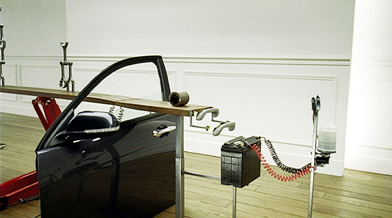
Is it the mascot likeability? - Does the mascots/characters of the advert take over the main focus of the advert?

http://www.youtube.com/watch?v=2XXskACWhm8
Or is the shock factor a great way to get the viewers attention? Does getting a fast reaction grasp the attention needed?

659 complaints (2011)
http://www.youtube.com/watch?v=N2oL_gXECtg
Or is it the catchy theme songs or annoying slogans?

http://www.youtube.com/watch?v=F_-9QFvhQWo
Are the most remembered advertisements actually deserving of the recognition that they get?

http://www.youtube.com/watch?v=qm5_Y6OvcS0

ON THE GO
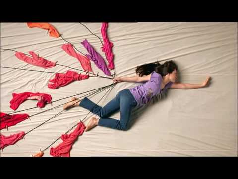
Quick update just to say that I have downloaded the blogger app and I really like it! I was expecting it to be very difficult to use but it does the job, so I will be blogging more than ever!
MY WORKSPACE
I have finally started to make my work space my own little studio. I am so happy with how it's coming together. I will definitely be more enthusiastic to get work done now that my 'studio' is girly and fun.
:)

:)


Monday, 1 October 2012
Julian Opie


Adobe Illustrator
After spending a couple of sessions on this programme I can officially say I'm not afraid of it any more. Before using illustrator, I had quite a negative feel towards it through either what I've heard or seen from it. However, how that I've tried it myself and had a brief go at it, I can say that it was rather enjoyable. Adobe Illustrator was a fun, easy and free programme to use whilst creating my own inspired Julian Opie portrait.
''Uh Oh''
My first 'set back' of the year...
I started to design my own logo, and for some odd reason I had put a must into my head, a must to make my last name (Pierce)be incorporated into it. I ended up going down the completely wrong root of design by illustration piercings and ears. I have now stopped and looked back at my work and reflected on it. I know now, that I don't want my logo to represent some sort of piercing shop, but me and only me. I am thinking about going into embossing and experimenting with mix media as I absolutely love the look of those two techniques.
Wish me luck!
Typography

First impression of thee Typography assignment was completely negative, not because of how it was given to me but because how naive I was about it. I've never looked into Typography closely, but I've come to realise that its not all straight cut and full of rules. I really enjoy finding new Typographer and ways of creating wonderful pieces.
I really like the artist Owen Gildersleeve. His way of mix media is incredible, it's everything that I love. The colour, shapes, randomness, craziness and just the 3D element excites me. I can't wait to create something inspired by Owen and many other typographers.

This is not a pipe

First assignment/essay given by Lee was to research into what this painting was about and how it made an effect on graphic design. It was rather confusing at first but once I got into it, I found out a lot more about Rene Magritte and surrealism as a whole. When we were first given the handouts by Lee, I straight away was reminded of the Cidre advert, but fellow students somewhat laughed at me for pointing that out. However now that they have looked into it, they came to realise that the Cidre advert was inspired by Rene. Pat on the back for Chloe? I think so.
Sunday, 30 September 2012
END OF WEEK THREE
Another week has passed and I seem to be getting more exciting work assignments.
I started to think about typography for Rachel and it really got me enthusiastic to get going on this assignment. I cant wait to explore and experiment with type. However, I need to remember to manage my time well or else I wont have enough time on other projects, like Lee's., who set out a task of researching into 'This is not a Pipe' painting and creating a written essay.
I started to think about typography for Rachel and it really got me enthusiastic to get going on this assignment. I cant wait to explore and experiment with type. However, I need to remember to manage my time well or else I wont have enough time on other projects, like Lee's., who set out a task of researching into 'This is not a Pipe' painting and creating a written essay.
SECOND TRIP
So, we went to Salford University to hear some lectures/talks about many different types of design. It was such an eye-opener to which areas of designs could potentially suit me or even inspire me that I haven't even thought about.
I admit some of the talks weren't as appealing to me personally but each one gave me pieces of information I didn't know about. So they were all useful in different ways.
Overall the talks gave me more enthusiasm to achieve and learn as much as those people did.
Tuesday, 18 September 2012
13/09/12
END OF WEEK TWO
Another week has gone by and so much has been covered yet again. I feel as though the first week was more of a welcoming and introduction into the course whereas the second week was when the work, paper print outs and deadlines started to appear. Once I got all of my paperwork printed out and piled up together, I think that was when I realised how much work is expected to put into this course. I wont deny that I got really nervous about it. I've never really been good at time keeping and organisation but I know at the end of the two year course I will be able to say I have definitely changed and improved.
Wednesday, 12 September 2012
05/07/12
DAY TWO - LIVERPOOL TATE GALLERY
Second day of the brand new course and we are already out, experiencing new things that surely inspired me if not all of my fellow class mates.We set off on our first trip of the course to Liverpool Tate Gallery where there were three artist's exhibitions (Turner, Monet and Twombly), which took only half an hour train ride. Even though I love paintings and art in general, I was quite negative towards spending so much time looking at one painting at a time. But now that I am reflecting back from the trip, I have realised that I haven't experienced an artist's painting truly before now. Usually I would have a quick glance at a painting and move on to the next one, however this trip taught me that you don't appreciate all the effort that has gone into those painting unless you look at every inch of the painting. It was also an eye-opener at how much art plays a big part in the design world.
Click here to view some of the photographs I had taken during the trip.
Link Below to the Liverpool Tate Gallery website:
http://www.tate.org.uk/visit/tate-liverpool
Link Below to the Liverpool Tate Gallery website:
http://www.tate.org.uk/visit/tate-liverpool
Subscribe to:
Posts (Atom)